How to Design a Tattoo With AI (Without It Looking Generated)
An AI tattoo generator is only as good as what you ask it for. The gap between a design that looks like clip art and one an artist would happily tattoo usually comes down to how you describe it. Here's the process that reliably gets a clean, usable result.
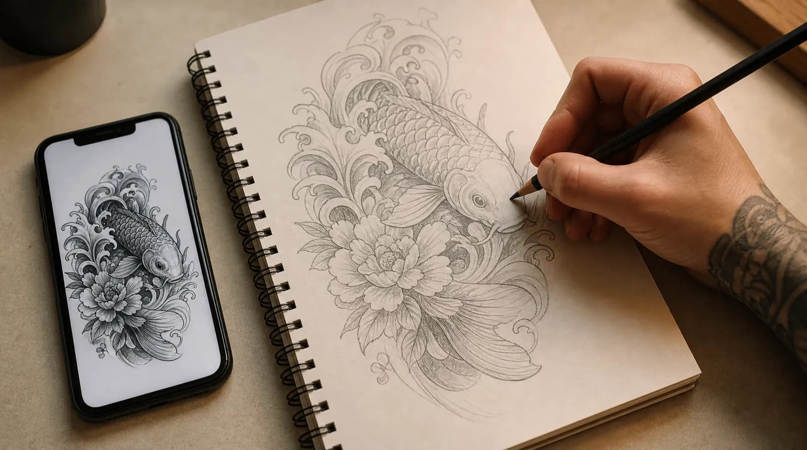
1. Start with the idea, not the picture
Before you touch a generator, get clear on three things: the subject, the feeling, and roughly where it goes on your body. "A tattoo of my dog" is a subject. "My dog's face with a soft, gentle expression, on my forearm" is a brief. The more you decide up front, the less you're leaving to chance.
It helps to write it as a sentence you'd say to an artist, not a search term. Artists design around meaning and placement - so does the model. If you genuinely don't have a subject yet, start from what it means to you instead: that's what the tattoo idea generator is for.
2. Pick a style on purpose
Style changes everything about how a design reads and how it ages. Fine line gives you delicate, minimal work; black and grey realism gives depth and likeness; American traditional gives bold, long-lasting classics. Choosing before you generate keeps the result coherent instead of a mash-up.
If you're not sure which suits your idea, that's a good use of the generator - run the same subject in two styles and compare. It's a lot cheaper than finding out on skin. There's a breakdown of all six styles if you want to see what each one is actually good at.
3. Write a prompt with specifics
Vague prompts produce vague, generic-looking art - the stuff that reads as "AI generated." Specific prompts produce designs with intent. A good description usually names four things:
- The subject and any secondary elements - "a single rose with two leaves and a small moon."
- The composition - "vertical, tall and narrow" versus "round and centered."
- The style and technique - "fine line, thin clean lines, minimal shading."
- The placement - "designed for the inner forearm."
What that looks like in practice
The difference is easier to see than to explain. Here's the same idea written three ways, from the version that produces stock-looking filler to the version that produces something an artist can work from:
- Too vague: "a wolf tattoo." You'll get a competent, forgettable wolf - the average of every wolf tattoo on the internet.
- Getting there: "a wolf head in black and grey realism." Better, but the model is still choosing the pose, the crop and the composition for you.
- Specific enough to be yours: "a wolf's head in three-quarter profile looking slightly upward, black and grey realism, heavy shading through the mane, clean negative space around the muzzle, vertical composition sized for a forearm."
4. Generate, compare, refine
Treat the first result as a draft, not a verdict. Generate a few, notice what's working, and adjust one thing at a time - swap the flower, simplify the background, change the orientation. Small edits to the description move the design more than starting over.
Changing five things at once tells you nothing about which change helped. Changing one tells you exactly what that word is doing. It's slower for about three generations and faster after that.
The goal isn't a finished tattoo on the first try. It's a strong reference that captures what you want, which you can then refine with a real artist.
5. Keep it tattoo-able
The most common mistake is asking for too much. Photographic backgrounds, tiny text, and dense detail look impressive on screen and blur on skin. Skin is not paper: it moves, it stretches, and ink spreads slightly through it for as long as you have the tattoo.
That spread is the whole reason bold, well-spaced work ages better than intricate work. Lines that sit close together on a screen will creep toward each other over the years until they read as one thick line. If a design depends on detail smaller than a grain of rice, it won't survive being a tattoo - it'll just become a smudge with good intentions.
The squint test
Before you take a design anywhere, do this: shrink it on your phone to roughly the size you'd actually get it tattooed, hold it at arm's length, and squint.
You're checking three things. Does it still read as one clear shape, or does it collapse into grey mush? Can you tell the elements apart, or have the fine details merged? Is there enough empty space that it'll still look intentional once the lines thicken?
If it fails, the fix is almost always subtraction - fewer elements, more space between them, thicker lines. A simpler design that holds up for twenty years beats an intricate one that looks incredible for two.
What to do with the design you end up with
Download the full-resolution file rather than screenshotting it, and keep the prompt you used - your artist will often ask what you were going for, and the wording you settled on answers that better than a description from memory.
Then book a consultation. A generated design is a reference, not a stencil, and the next step is a human one: here's how to bring it to your artist without it landing badly.
Frequently asked
- Can AI actually design a good tattoo?
- Yes, when you treat it as a design tool rather than a magic button. A specific prompt in a chosen style produces a clean, artist-ready reference. Vague prompts produce generic art - the difference is in the brief.
- Should I show the AI design to a tattoo artist?
- Always. The generated design is a starting point; your artist adapts it to your body, checks that the linework will hold, and makes it uniquely yours.
- How long should a tattoo prompt be?
- One or two sentences is usually the sweet spot - long enough to name the subject, style, composition and placement, short enough that nothing competes for attention. Very long prompts tend to produce cluttered designs because the model tries to include everything you mentioned.
- Why do my AI tattoo designs look generic?
- Almost always because the prompt describes a category rather than a specific image. "A butterfly tattoo" asks for the average of every butterfly tattoo. Naming the pose, the composition, the line weight and the placement is what turns an average into a particular design.
- What size and placement should I ask for?
- Pick the placement before you generate, because it decides how much detail the design can carry. Small areas like the wrist, ankle and collarbone need simple shapes and few elements; the forearm, thigh and back can hold detail that would blur at a smaller scale.
- Can I use a photo of myself or my pet as a reference?
- You can generate a design based on a described likeness, and our tattoo try-on tool renders a design onto a photo of your own skin so you can judge scale and placement. For a genuine portrait, though, a photo handed to a portrait specialist will beat any generated version.
Put it into practice.
Describe your idea and get a clean, ready-to-ink design in seconds.
Start designing